Badge design mistakes every Event Organiser has made at least once
- Cat Thompson
- Reading time: 7 mins
Decisions regarding badges made weeks before your event can cause real problems on the day. Most of these mistakes are invisible until badges are in attendees’ hands, an exhibitor’s scanner fails to read a QR code, or a delegate queue snakes back through the registration hall.
1. Leaving it too late
For those new to event organising, badge ordering is almost always a last-minute thought. It shouldn’t be.
A printed badge order involves artwork approval, attendee data sign-off, print production, and delivery. Each step takes time. Each step has a point at which an issue can be caught and corrected. Compress the timeline and you remove those checkpoints. You may also increase the cost due to rush fees.
Plan to have your printed lanyard order placed at least three weeks before the event. That window gives you time to receive and review a proof, and still have a buffer if, worst case, something needs to be reprinted.
For badges, don’t hold on to both your artwork and your data until the last minute, just because your data is still subject to last-minute registrations. Holding both back means your artwork won’t get discussed early enough and the setup and proofing process gets compromised. Your badge supplier can set up your artwork proof and get your approval long before your data is due to arrive.
Given that your event brand has probably been agreed months ahead of the event, having sufficient design assets to get a badge proofed shouldn’t be an issue, so it’s something you can get off your tick list early.
If your event timeline genuinely cannot accommodate that, onsite badge printing removes the dependency on pre-event production entirely. Badges get printed as delegates arrive, which means last-minute attendee additions and name changes are handled at the desk, not by phone to a printer the night before. Conference Badges offers onsite badge printing across the UK, with badges produced in six seconds per delegate.
2. Text too small to read at a glance
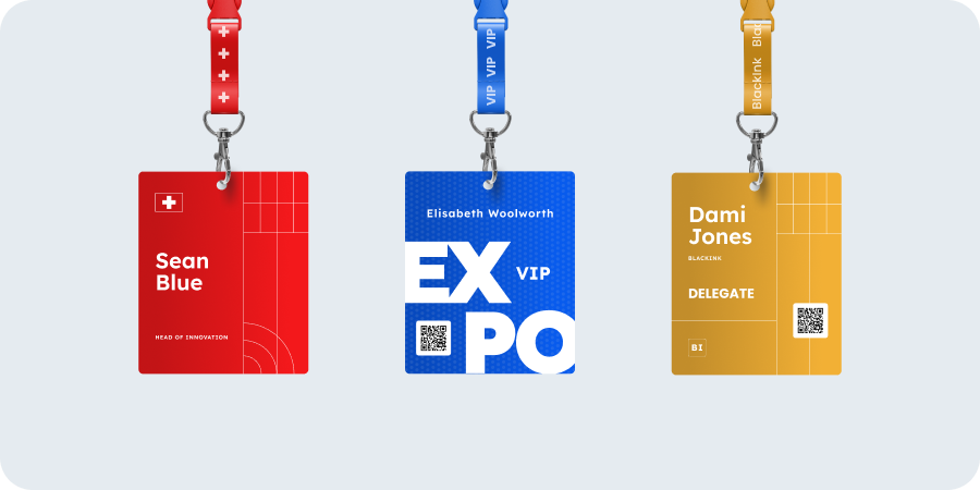
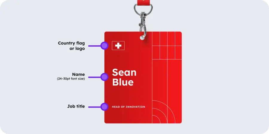
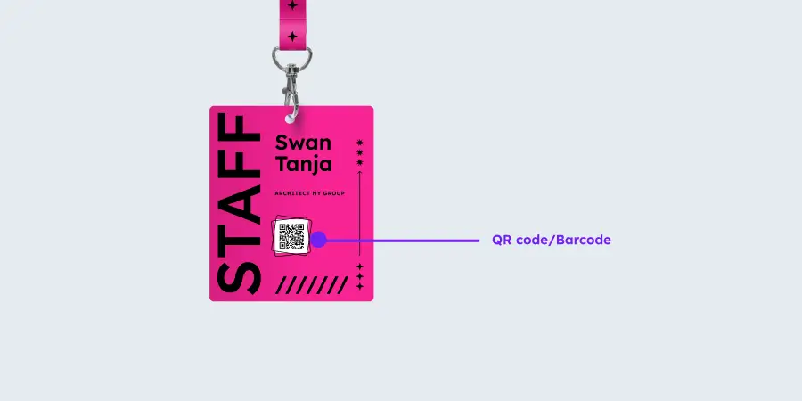
Two things usually matter more than anything else on a badge: first name and organisation / company name. They are the two most important pieces of information on any personalised event badge.
They sort out two important needs in networking:
They avoid the embarrassment of not knowing someone’s name when you meet them
They help people network by allowing them to spot who works for a company that they want to deal with.
But both are regularly printed too small. Usually because the designer wanted the branding to jump out, or copious amounts of whitespace.
We understand design principles mean good use of whitespace, but don’t kill the function of a badge for it. A badge works at arm’s length, or it does not work at all.
If someone needs to lean in to read a delegate’s name, the badge has failed its primary job. The delegate’s first name should be the largest element on the badge. Company name sits below it, noticeably smaller but still legible from a metre away.
This matters beyond simple legibility. At a conference or exhibition, attendees scan badges in seconds to decide whether someone is worth approaching. Exhibitors scan to qualify leads before committing to a conversation. A badge where the name is illegible slows that down and creates awkward “is he staring at my chest?” moments. Good badge design serves the attendee first, not the organiser’s brand.
Before approving a badge design, print a test sheet and read it from a standing distance. What looks fine on screen often reads differently in print.
In contrast, dark text on a light background is readable under all lighting conditions. White text on a coloured or photographic background is frequently not. This also matters for delegates with visual impairments. If your event has accessibility commitments, high-contrast typography is non-negotiable, not a design preference.
3. Not printing both sides, and then badges flip around
A badge printed on one side only will rotate. Lanyards pivot, attendees move, and within minutes a proportion of your delegates are walking around with a blank white reverse facing outward.
Printing both sides solves this. The reverse can carry event branding, session information, sponsor details, or a QR code. It can also carry genuinely useful reference content for delegates: the venue Wi-Fi password, a session timetable, a floor plan, or an emergency contact number. Even a simple repeat of the front design is better than a blank white panel.
If budget or production time rules out double-sided printing, a heavier cardstock reduces rotation. It is not a complete fix, and double-sided is always preferable.
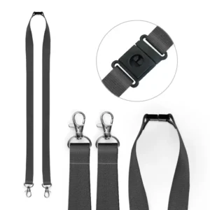
One additional fix: double-clip lanyards. A standard single-clip lanyard lets the badge swing freely. A double-clip version holds the badge at two points, keeping it flat against the body and consistently facing outward. It is a small detail with a visible difference across an entire event.
4. Choosing the wrong badge material for your event
Not every event needs the same badge. The material you choose affects durability, print quality, and how the badge holds up across a full day or multiple days of wear.
Card stock is the standard choice and works well for most single-day events held indoors. For a two-day conference or an event with outdoor elements, a heavier card or laminated finish prevents badges from going soft at the edges or becoming difficult to read by day two.
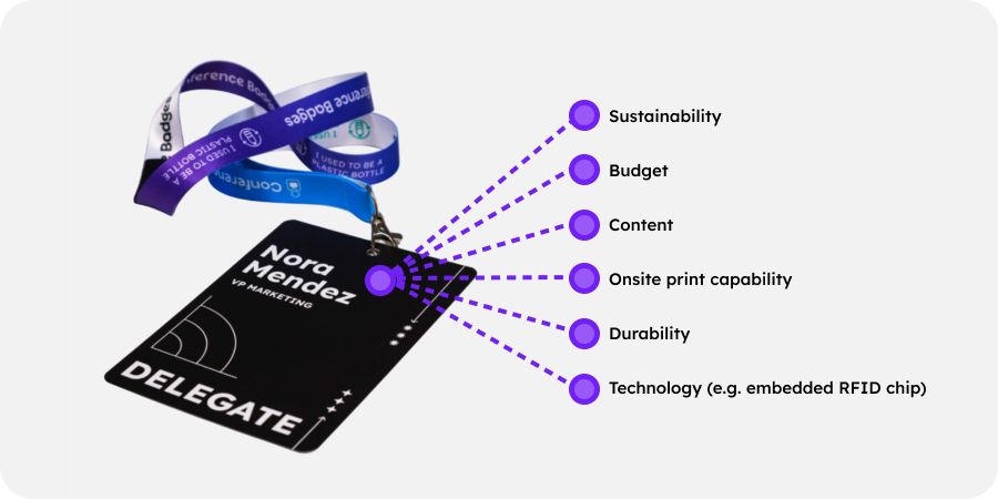
Material choice also carries a signal about your event’s values. Single-use plastic for one-day indoor events isn’t a great green signal, although you can allay some of the concern by letting guests know that PVC is 100% recyclable (and you can help make sure it is recycled).
But there are also now practical alternatives that do not compromise on quality, such as recycled card and compostable card.
If sustainability is part of your event’s positioning and values, your badge should reflect it. Conference Badges supplies badges made with sustainably sourced FSC-certified card and other sustainable materials.
The one thing to avoid: choosing material based on price alone without considering the event context. A badge that deteriorates visibly during the event reflects on the organiser.
5. A QR code that exhibitors cannot scan
QR codes on personalised event badges need to be scannable at speed: by exhibitors using lead capture apps, by registration staff checking attendees in, and by session-tracking systems at room entrances.
A QR code that is too small, too low-contrast, or placed over a background pattern will fail. The consequences are slow check-in queues and exhibitors who cannot capture leads.
Minimum recommended QR code size on an A6 badge is 20mm square. If you’re encoding more than 20 characters in it, consider going larger.
It should sit on a plain white or light background with no overlapping design elements. Test it with the actual scanning device or lead capture app your exhibitors will use, not just a phone camera, before approving the final design.
One point that is frequently missed: onsite badge printing and pre-printed badge designs use different equipment. Test the QR code against the actual printer that will be used at the event, not just in a digital proof. A code that renders perfectly on screen can produce a scannable but degraded result on a thermal direct printer, particularly at smaller sizes.
And the biggest clanger? When you meant to have personalised QR codes (e.g. for link exhibitor lead capture) but you unintentionally printed everyone’s badge with the same QR code. This is no small error, since humans don’t notice the QR codes all look the same, so often it doesn’t get noticed until after the event, when all the reports are wrong.
6. Factual errors repeated hundreds of times
A personalised event badge carries the event name, event date, and sometimes session or ticket-type information. Any factual error in the badge template is reproduced across your entire print run. It’s evidence of an error that everyone can take home with them!
A wrong event date on 500 badges is not a single problem. It is a reprint or an explanatory conversation at every registration desk.
Treat the badge template as a document requiring sign-off, not just a design proof. Confirm the event name spelling, the date format, and any variable data fields with someone who is not the designer. A second pair of eyes on a proof takes five minutes. A reprint can take days and jeopardise your logistics schedule.
Top tip: You don’t really need to put the event date on the badge, since by the time it’s being worn every wearer knows what date it is. But if you do put the full date on it, including the day, ensure that both the day and date are right. e.g. if you say Tuesday 1 September, check that 1 September is indeed a Tuesday.
7. A sorted spreadsheet that silently scrambles your attendee data
This is the mistake that is hardest to spot and most damaging when it happens.
An attendee data file typically contains columns for first name, last name, company, job title, ticket type, and QR code data. If you sort a single column, say, sorting surnames alphabetically, without selecting all columns simultaneously, you detach the data. Surnames will be in order. The first names, companies, and QR codes attached to them will not.
The result is a print run where names and companies are mismatched across every badge. It will not be obvious until delegates start checking in.
Always sort using the full dataset selected. If you are unsure whether all columns are included in a sort, use a filter instead. And always do a spot-check: print five test badges and confirm the name, company, and QR code all belong to the same person.
Get the badge right before the event, not on the day
Our team at Conference Badges reviews badge designs as part of the order process and flags common issues before production begins. Call us to help get your badge right and avoid some of these costly badge printing pitfalls.