Creating impactful events: Core principles for name badge design
- Nick Thompson
- Reading time: 10mins
Event badges are powerful networking tools that improve the whole attendee experience and help to establish connections, not only identification tools. A well-designed badge can have a big influence on participants’ interactions and involvement all through your event. To help your next conference, seminar, or business meeting stand out, let’s investigate the key components of successful name badge design.
Why event badge design matters
One should first grasp why badges matter before delving into particular design aspects. Name badges have several important purposes when attendees enter an event venue: they identify participants, provide vital information, create a feeling of belonging, and, by simplifying introductions, help to break down social barriers. A well-crafted badge recognises and uses these psychological elements to establish a more harmonious event setting.
Essential elements
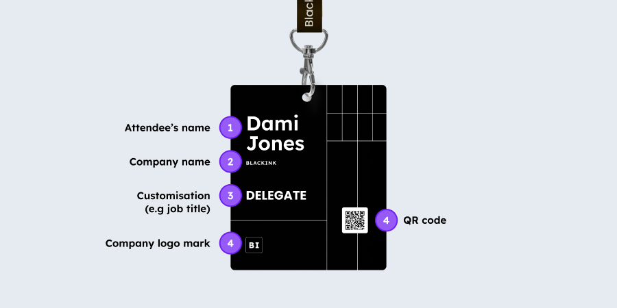
Every successful name badge should contain some basic information, carefully balanced to give clarity without overpowering the design:
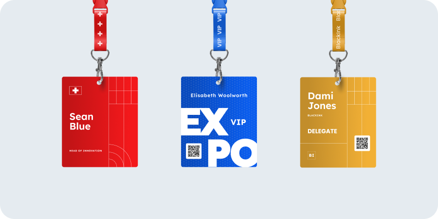
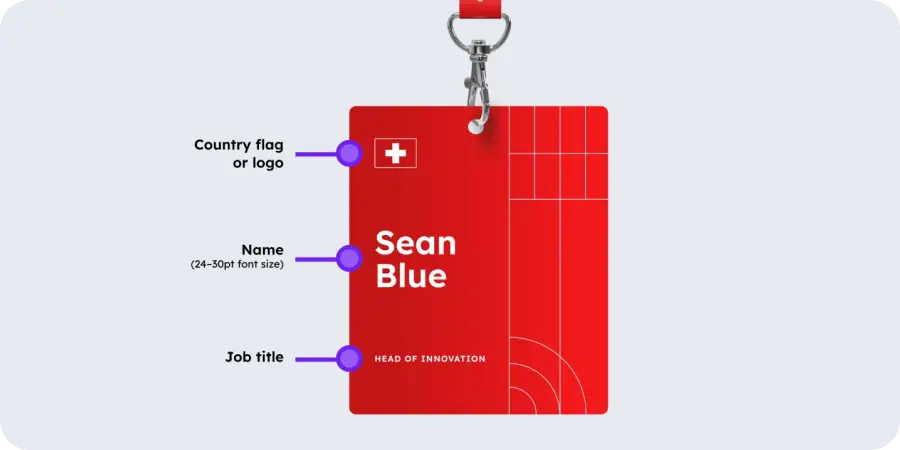
- The most obvious element should be the attendee’s name: It should be preferably readable from six to ten feet away. Clearly highlight first names (24–30pt font size) for simplicity of reading. Though smaller, last names are still quite legible.
- Organisational information: Including the company name and job title links attendees and helps to set the scene for discussions.
- Indicators of roles: Differentiating speakers, staff, sponsors, and general attendees—by colour coding, icons, or text—helps participants negotiate social interactions suitably.
- Event branding refers to: Including your logo, colours and typography. Remember that while branding is important, the name badge should primarily be functional and assist attendees in making connections.
Typography considerations
Your badge’s readability is quite important, thus typography is among the most important design choices:
- Selection of fonts: For best legibility at a distance, choose simple sans-serif fonts, including Arial, Helvetica, or Futura. Steer clear of ornamental or script fonts that might look great but compromise readability.
- Scale hierarchy: Usually first names should be prominent (24–30 pt); last names can be smaller in size (18–22 pt). Other material should be scaled in line with its significance, never so small that reading calls for squinting. Not everyone has 20-20 vision, so ensure the badge design allows all attendees to benefit from the information on them.
- Case considerations: While keeping readability, using mixed cases for first names and ALL CAPS for last names makes a visual difference. For instance, “Sarah Johnson” is more scannable than “Sarah JOHNSON.”
- Opposing contrast: Make sure text and background contrast is strong; black text on white or light backgrounds is still the most readable mix, especially in the typical varying lighting at events. It is also reproducible for all onsite printers, whereas a coloured or inverted colour scheme may not be.
Visual design elements
- Colour psychology: used strategically, it can improve the efficacy of your name badge design. Colours can classify attendees, highlight key information, or support brand identity by triggering emotional reactions.
- White space: Fight the want to cover every part of the badge. Enough white space makes the design professional and increases readability.
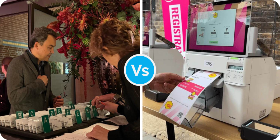
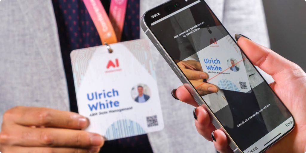
- Technology integration and QR codes: Think about adding QR codes connecting to digital profiles, conference plans, or networking sites. These should be large enough to be easily readable by the device that will scan them (mobile phone or a badge scanner). However, make sure these components don’t take center stage in the design or obscure the name’s visibility. For this reason, you may want to consider larger badge sizes that give you layout options.
- Badge width and orientation: Usually, standard badge sizes run from 3″×4″ to 4″×6″. Although vertical badges look great for particular events, mostly when worn on lanyards, horizontal designs usually provide more design flexibility and are the most popular choice when using other types of attachment.
Material and production considerations
The physical characteristics of your badges greatly affect impression as well as utility:
- The durability: Choose products suitable for the length of your event. Standard cardstock should allow single-day events to be acceptable. Simultaneously, multi-day conferences gain from more robust choices, including synthetic papers, laminated cards or PVC.
- Attachment methods: Consider the badge’s use and wearability. For longer events, lanyards provide visibility and comfort; for shorter meetings, clips or pins could be more fitting. For crew who are working onsite, the attachment may not be suited to the task they’re performing, so you may want to give them options. A professional look is created by magnetic attachments which are especially kind to clothing.
- Sustainable badges: Event planners are now giving environmental impact more thought. Among the options are biodegradable badge holders, recyclable materials, or collection sites for reusing elements following the event.
- Printability: High-quality printing guarantees that every element, including logos and images, looks professional and clear, so reflecting the general quality of your event.
Special considerations for different event types
Different events call for different name badge designs:
- Corporate conferences: Professional appearance is critical, with obvious organisational ties.
- Industry trade shows: Badges might have to include product interest categories or buyer/seller indicators to enable suitable business contacts. Also, consider whether there are any ‘icebreaker’ opportunities on the name badge, given the data you have about your attendees.
- Academic conferences: These include institutional affiliations or research areas meant to support pertinent intellectual debates.
- Community or networking events: These can have more laid-back designs with conversational starters or personal interests meant to help relationships.
- International events: You can print a national flag indicating the country your delegate hails from, which can help conversations to flow by removing the obstacle of not knowing which country other attendees are from.
Testing your design
Before finalising your name badge design:
- Create actual prototypes and test readability from several distances.
- See how the badge appears when worn (often lanyards cause badges to flip or tilt).
- Get comments from a small group comprising several points of view on stakeholders.
- Test under lighting like that of your venue.
Conclusion
Event badges represent a critical touchpoint in your attendee experience. Thoughtfully crafted, they do much more than name attendees; they strengthen your brand, help to create meaningful relationships, and help your event to be generally successful.
Remember that the most effective badge designs balance information density with clarity, prioritising the human connections they are meant to facilitate. Applying these ideas to your next event will produce professional-looking badges that actively improve the networking experience for every attendee.
At Conference Badges, we specialise in turning these design concepts into reality with premium materials, cutting-edge printing technology, and personalised service tailored to your specific event needs. Whether you’re planning an intimate corporate gathering or a large-scale international conference, our team can help you create badges that not only look professional but also actively enhance the attendee experience.