TOP QUALITY
EXPERT SUPPORT
SCALABLE SOLUTIONS
EXPRESS SHIPPING
neurodivergent attendees at your event
How to guides, Tips and advice

How to support neurodivergent attendees at your event

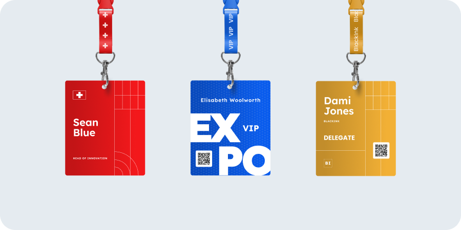
What this guide covers Practical, low-cost ways to reduce stressors for neurodivergent attendees across every stage of your event. Not every tip will apply to every event. The goal is to find the quick wins that make the biggest difference. Worth noting: neurodivergent-friendly thinking benefits everyone. We’re all subject to the stresses of crowded spaces, pressure to network, and sensory overload. “Wellbeing is not fluffy, it’s strategic.” — EventWell.org Contents Quick-win checklist Pre-event communication Event registration and check-in Sensory environment Exhibitors and speakers Signage, wayfinding, and venue layout Schedule and session design Networking and social spaces Food, drink, and breaks Staff training Event day policies Post-event follow-up Quick-win checklist These are the highest-impact, lowest-cost changes any event organiser can make: A quiet room — clearly signposted and genuinely quiet A neurodiversity/accessibility page on the event website Clear maps and signage with consistent naming across all communications Plain-English joining instructions sent early Earplugs available at reception Staff trained to be calm, patient, and direct Freedom to leave and re-enter sessions without judgement A predictable schedule with proper breaks between sessions “Burnt out attendees don’t convert, overwhelmed staff don’t perform, unsafe spaces damage reputation.” — EventWell.org The rest of this guide breaks each area down in detail. Pre-event communication Clear, structured information reduces anxiety before anyone arrives. Publish the schedule early with start/finish times, breaks, and locations Add a visual map showing quiet rooms, toilets, food areas, registration, first aid, and exits Share photos of key areas (entrance, registration desk, main hall) so the space feels familiar before arrival Explain the arrival process step by step: queueing, badge collection, where to go next Include transport details for parking, public transport, and accessible entrances Repeat key information across email, web pages, and on-site signage Don’t bury critical details. “Bring ID”, “download the app”, “arrive 30 minutes early” — if something matters, it needs to be visible, not hidden in long paragraphs Consider adding a neurodiversity or accessibility page to the event website. Plain language, no padding. A simple contact form for attendees to let you know their needs is better than a phone-only option. Event registration and check-in Registration is every attendee’s first physical interaction with your event. A smooth, low-stress check-in sets the tone for the rest of the day. Offer multiple check-in options: a standard desk, a quieter low-interaction desk, and self check-in kiosks Position check-in away from loud music or PA speakers Train registration staff to be calm, patient, and direct — no pressure, no forced small talk Ensure you have an efficient badge collection process to speed up arrivals and reduce queuing (benefits everyone, but especially those who find crowds stressful). Print-on-demand badges and self-service stations are often better for this than pre-printed badges, which can create an awkward moment if someone’s badge isn’t found. But back up your self-service station with a nearby helpdesk that also has badge printing capability. Don’t force attendees to go the self-service route if they come to the helpdesk. If you do print badges in advance, make sure staff look calm and competent, and don’t make a fuss if the badge is missing. Offer early badge collection to remove one stressor from event day Consider colour-coded lanyards or sticker systems for communication preferences — green = “open to chat”, amber = “happy just looking” People are more open about being introverts now. Many prefer to signal this rather than find themselves in uncomfortable conversations. Sensory environment Sound, light, and crowding are the three biggest sensory triggers at events. Small adjustments here have an outsized impact. Provide at least one quiet room — genuinely away from the noise, not a corner of the main hall Signpost the quiet room clearly and don’t let it become a meeting room or call space Keep background music low in networking areas (or skip it entirely) Avoid flashing lights, strobes, and aggressive LED screens Provide earplugs at reception — cheap and high-impact Offer low-sensory seating areas away from speakers and busy walkways Avoid overpowering scents from diffusers or heavy air fresheners Plan wide aisles and identify where bottlenecks are likely to occur When people feel physically trapped in crowds, anxiety compounds quickly. Exhibitors and speakers Exhibitors and speakers are at the event for extended periods, often without the option to step away. They deserve the same consideration. Offer low-sensory stand locations away from main stage speakers or busy entrances Allow exhibitors extra space behind the stand, with access to quiet room facilities Provide lead capture with dictation so stand staff with dyslexia can speak notes into an app rather than write them down Offer speakers rehearsal time and alternative lighting if spotlights cause discomfort Encourage low-pressure lead capture: “Scan here and we’ll email you” or “Take a leaflet and follow up later” Make it clear that badge scanning requires consent — this reduces anxiety about being approached unexpectedly Signage, wayfinding, and venue layout Consistent signage is critical for neurodivergent attendees who rely on predictability. Use large text, high contrast, and simple arrows Keep room names consistent across your event app, printed schedule, and on-site signs Avoid naming conflicts — “Stage A” on the app but “Main Theatre” on the sign creates confusion Use colour-coded zones and keep the system simple Provide multiple routes between key areas for when main corridors get congested Schedule and session design Publish start and end times for every session, including Q&A Avoid surprise schedule changes. If unavoidable, push updates through multiple channels Build buffer time between sessions for transition and decompression Set clear expectations in session descriptions: lecture, panel, workshop, or audience participation? Ticketed or open? How early to arrive? Flag sessions that include loud demos, filming, or audience interaction Make participation optional. “Turn to the person next to you” excludes people who find spontaneous interaction difficult Networking and social spaces Not everyone attends events to network. Offering a no-networking-required experience is a small shift that makes a big difference. Use structured networking formats: topic tables, hosted introductions, small-group sessions Try topic

name badge design
How to guides, Tips and advice

Creating impactful events: Core principles for name badge design

Event badges are powerful networking tools that improve the whole attendee experience and help to establish connections, not only identification tools. A well-designed badge can have a big influence on participants’ interactions and involvement all through your event. To help your next conference, seminar, or business meeting stand out, let’s investigate the key components of successful name badge design.   Why event badge design matters One should first grasp why badges matter before delving into particular design aspects. Name badges have several important purposes when attendees enter an event venue: they identify participants, provide vital information, create a feeling of belonging, and, by simplifying introductions, help to break down social barriers. A well-crafted badge recognises and uses these psychological elements to establish a more harmonious event setting. Essential elements Every successful name badge should contain some basic information, carefully balanced to give clarity without overpowering the design: The most obvious element should be the attendee’s name: It should be preferably readable from six to ten feet away. Clearly highlight first names (24–30pt font size) for simplicity of reading. Though smaller, last names are still quite legible. Organisational information: Including the company name and job title links attendees and helps to set the scene for discussions. Indicators of roles: Differentiating speakers, staff, sponsors, and general attendees—by colour coding, icons, or text—helps participants negotiate social interactions suitably. Event branding refers to: Including your logo, colours and typography. Remember that while branding is important, the name badge should primarily be functional and assist attendees in making connections.    Typography considerations Your badge’s readability is quite important, thus typography is among the most important design choices: Selection of fonts: For best legibility at a distance, choose simple sans-serif fonts, including Arial, Helvetica, or Futura. Steer clear of ornamental or script fonts that might look great but compromise readability. Scale hierarchy: Usually first names should be prominent (24–30 pt); last names can be smaller in size (18–22 pt). Other material should be scaled in line with its significance, never so small that reading calls for squinting. Not everyone has 20-20 vision, so ensure the badge design allows all attendees to benefit from the information on them. Case considerations: While keeping readability, using mixed cases for first names and ALL CAPS for last names makes a visual difference. For instance, “Sarah Johnson” is more scannable than “Sarah JOHNSON.” Opposing contrast: Make sure text and background contrast is strong; black text on white or light backgrounds is still the most readable mix, especially in the typical varying lighting at events. It is also reproducible for all onsite printers, whereas a coloured or inverted colour scheme may not be.     Visual design elements Colour psychology: used strategically, it can improve the efficacy of your name badge design. Colours can classify attendees, highlight key information, or support brand identity by triggering emotional reactions. White space: Fight the want to cover every part of the badge. Enough white space makes the design professional and increases readability. Technology integration and QR codes: Think about adding QR codes connecting to digital profiles, conference plans, or networking sites. These should be large enough to be easily readable by the device that will scan them (mobile phone or a badge scanner). However, make sure these components don’t take center stage in the design or obscure the name’s visibility. For this reason, you may want to consider larger badge sizes that give you layout options. Badge width and orientation: Usually, standard badge sizes run from 3″×4″ to 4″×6″. Although vertical badges look great for particular events, mostly when worn on lanyards, horizontal designs usually provide more design flexibility and are the most popular choice when using other types of attachment. Material and production considerations The physical characteristics of your badges greatly affect impression as well as utility: The durability: Choose products suitable for the length of your event. Standard cardstock should allow single-day events to be acceptable. Simultaneously, multi-day conferences gain from more robust choices, including synthetic papers, laminated cards or PVC.  Attachment methods: Consider the badge’s use and wearability. For longer events, lanyards provide visibility and comfort; for shorter meetings, clips or pins could be more fitting. For crew who are working onsite, the attachment may not be suited to the task they’re performing, so you may want to give them options. A professional look is created by magnetic attachments which are especially kind to clothing.  Sustainable badges: Event planners are now giving environmental impact more thought. Among the options are biodegradable badge holders, recyclable materials, or collection sites for reusing elements following the event. Printability: High-quality printing guarantees that every element, including logos and images, looks professional and clear, so reflecting the general quality of your event.   Special considerations for different event types Different events call for different name badge designs: Corporate conferences: Professional appearance is critical, with obvious organisational ties.  Industry trade shows: Badges might have to include product interest categories or buyer/seller indicators to enable suitable business contacts. Also, consider whether there are any ‘icebreaker’ opportunities on the name badge, given the data you have about your attendees. Academic conferences: These include institutional affiliations or research areas meant to support pertinent intellectual debates. Community or networking events: These can have more laid-back designs with conversational starters or personal interests meant to help relationships. International events: You can print a national flag indicating the country your delegate hails from, which can help conversations to flow by removing the obstacle of not knowing which country other attendees are from. Testing your design Before finalising your name badge design: Create actual prototypes and test readability from several distances. See how the badge appears when worn (often lanyards cause badges to flip or tilt). Get comments from a small group comprising several points of view on stakeholders. Test under lighting like that of your venue. Conclusion Event badges represent a critical touchpoint in your attendee experience. Thoughtfully crafted, they do much more than name attendees; they strengthen your brand, help to create

Scroll to Top